
Climate conferences serve multiple purposes. Besides being important political events, they are also global media spectacles which push the topic of climate change to the top of political, scientific and public agendas.
Scientific data is always at the heart of the way climate change is discussed. Whether it be weather records, measurement of greenhouse gasses in the atmosphere or the PH-value of the oceans.
Aside from data derived from the natural sciences, there are many other sources. One such example is the database our Online Media Monitor. It is creating data about media coverage on climate change around the world. Climate data is not only interesting for scientists – it can also be a tool for journalists. Data journalists find stories hidden behind the numbers to help readers understand something which otherwise might be impenetrable and complex.
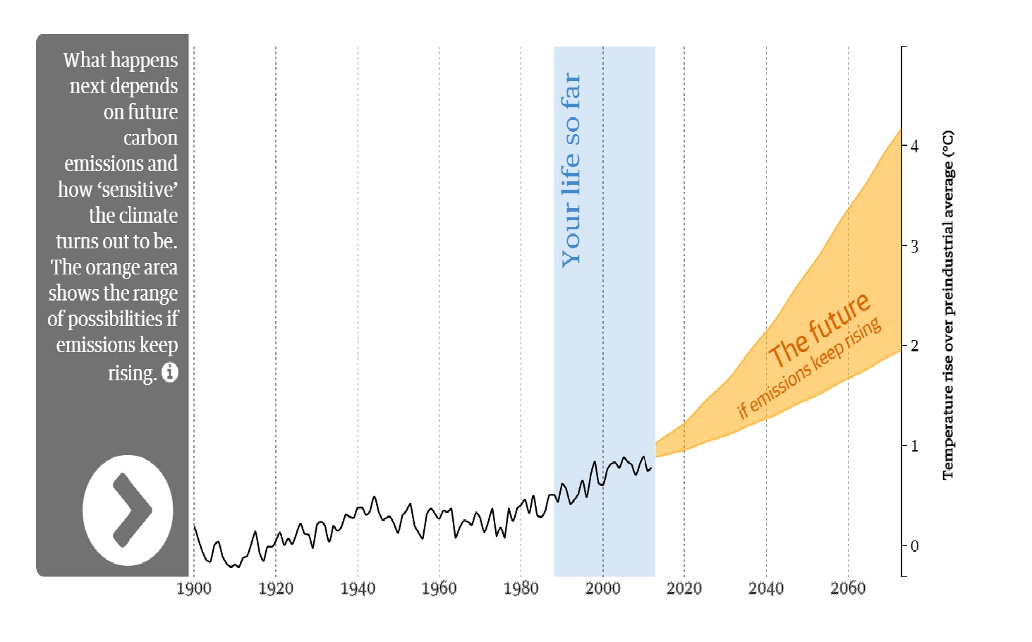
My research shows that data journalists increasingly use personalized coverage to counter the abstractness of the data. Personalized visualizations or news apps allow readers “to find their own narratives amongst the data points” (Yale Climate Connections 2014). The first projects allowing personalized coverage related to climate change were personalised carbon footprint calculators, as shown in this early example from 2009.
In the meantime, these calculators include more detail and are available in many languages. An example is the German “CO2-Rechner” by the WWF Germany. Below I’ve posted other examples that I’ve collected over the past years.
This infographic from 2014 shows how high the sea levels will rise, if the meltdown of the polar ice continues: “When Sea Levels Attack”. Another Guardian interactive, accompanying the last climate conference in Lima (Peru), showed how the global carbon emissions have evolved since the beginning of the industrial revolution: “Carbon emissions: past, present and future.”
A more recent example of an interactive feature dealing with climate data is the “Climate Change Calculator” by the Financial Times. It shows how the global temperature will evolve in different scenarios, depending on how much the world’s nations reduce their carbon dioxide emissions. The intention behind the project is “to show the effectiveness of nations’ pledges in advance of the COP21 climate summit to prevent dangerous climate change” (Hay 2015). The calculator is easy to use and helps to visualize the pledges different nations have made.
These are just a few examples of how climate change is covered by data journalism but more projects are regularly released. As climate change is a very complicated and multi-layered topic, data journalism tries to make a contribution towards helping people understand this important issue and its relevance to everyday folk.
Sources
Hay, Nick: “Will data journalism unravel the climate spiral of silence?” Climate-KIC Blog, 27 October 2015. http://www.climate-kic.org/blog/will-data-journalism-unravel-the-climate-spiral-of-silence/
Loosen, Wiebke/Reimer, Julius/Schmidt, Fenja: “When Data Become News. A Content Analysis of Data Journalism Pieces.” Future of Journalism Conference, Cardiff, 11 September 2015. http://www.researchgate.net/publication/281581852_When_Data_Become_News_-_A_content_analysis_of_data_journalism_pieces
Yale Climate Connections: “Data Journalism: Do the Numbers Add Up to Climate Action?” On Journalism, 23 April 2014. http://www.yaleclimateconnections.org/2014/04/data-journalism-do-the-numbers-add-up-to-climate-action/